

Testimonials
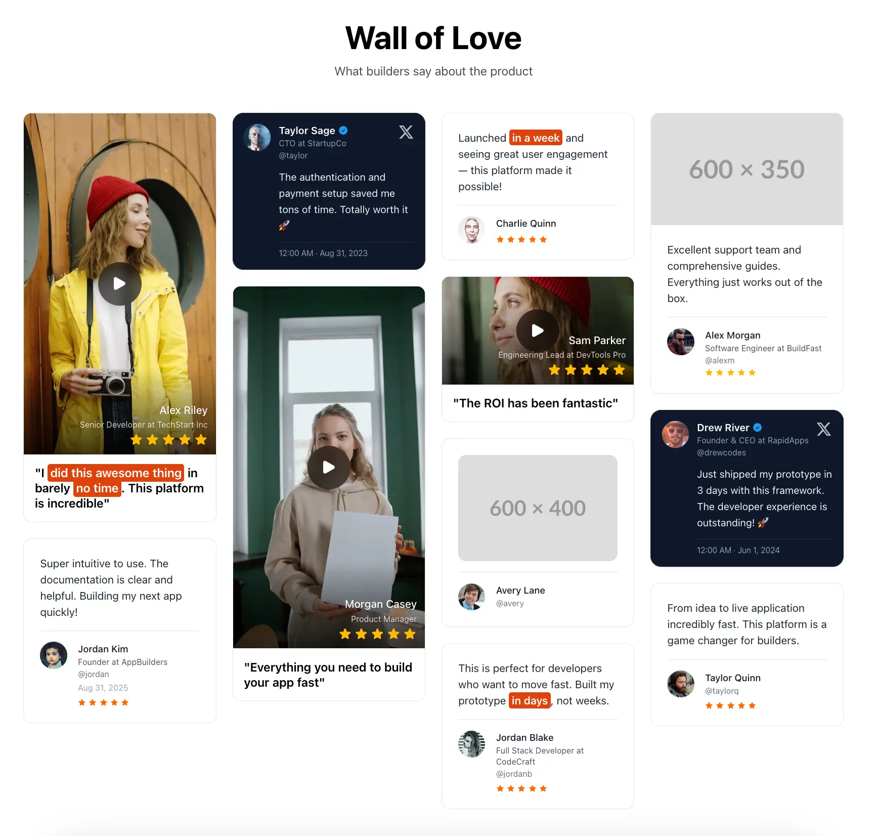
The testimonials component showcases user testimonials (in text, video, or photo format) in a fully responsive and beautiful masonry grid.
The testimonials component can also be used as a carousel instead of a masonry grid, to highlight specific testimonials:
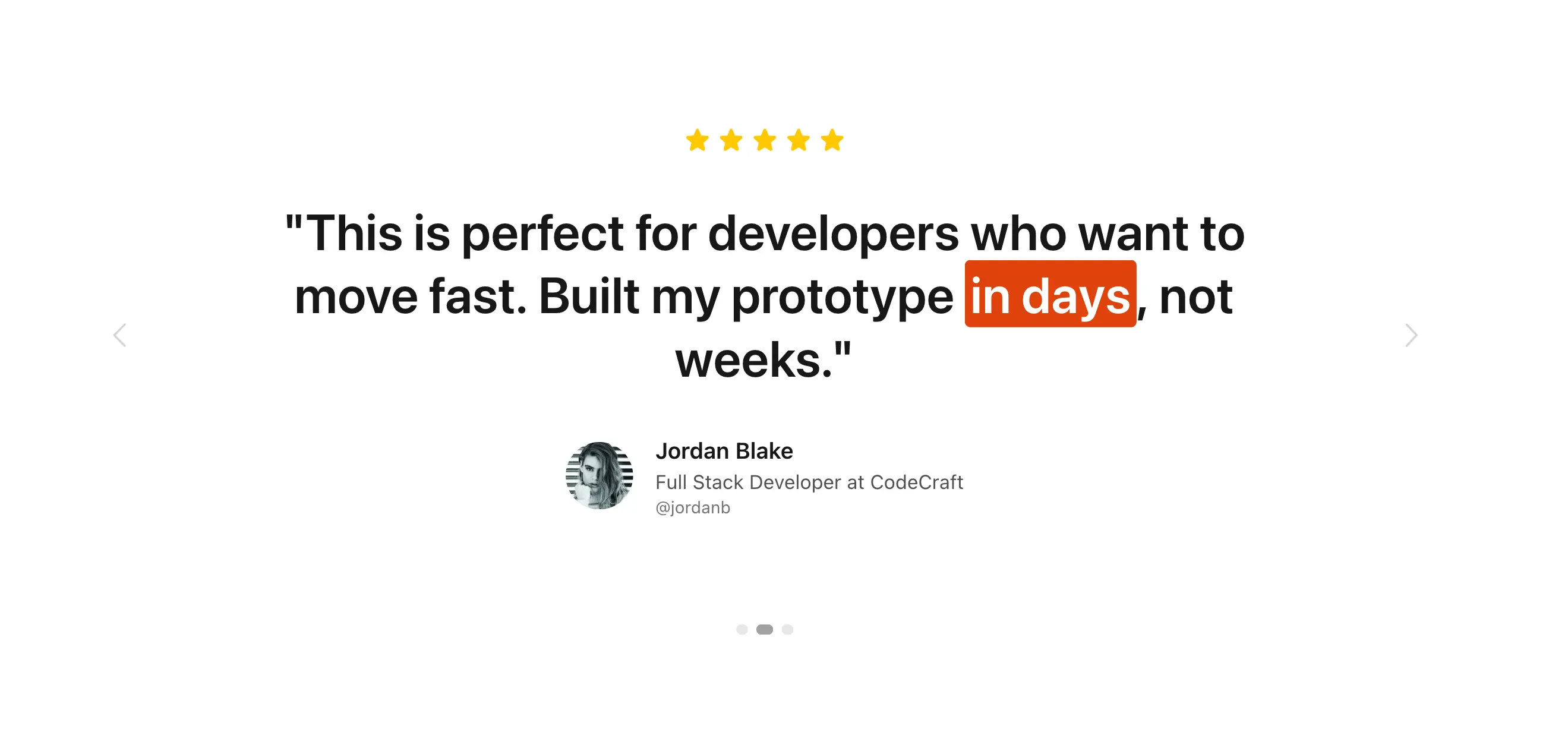
Use it like:
<%= render "components/railsfast/marketing/testimonials",
  mode: :carousel,
  tag: "featured",
  limit: 3 %>

<%= render "components/railsfast/marketing/testimonials",
  mode: :grid,
  title: "Wall of Love",
  subtitle: "What builders say about the product" %>
Parameters:
mode::grid(default, masonry grid),:carousel(one prominent quote at a time) or:marquee(an endless horizontal strip)items: an array of testimonial hashes to render instead of the config file (optional)ids,tag,kind,limit: pick a subset of the configured testimonials (optional)columns: responsive grid columns for:grid(default:{ sm: 2, lg: 3, xl: 4 })title,subtitle: section heading (optional)section_id: HTML id for the section (optional)theme:"light"(default) or"dark"speed: marquee speed in pixels per second (default:40)css_class: classes for the section wrapper (default:"py-12 sm:py-16")
The same selection is available in Ruby through the testimonials(tag:, kind:, limit:, ids:) and testimonial(id) helpers.
The component draws all testimonials from the config file config/railsfast/testimonials.yml. Restart your server (bin/dev) after editing it, because it is loaded once at boot.
Config structure:
defaultaccent_color: highlight/accent color shown in all testimonial cards (example:"#df430d")accent_text_color: text color on highlighted/accented text (example:"#fff")star_max: maximum number of stars in every star rating the components draw (default:5)default_avatar_url: fallback avatar whenavatar_urlis missing
development/test/production: you can have different sets of configurations and testimonials per environmenttestimonials: array of testimonial entries
To highlight any text in the testimonial, wrap any words in double brackets to highlight them with your accent color, like this:
Launched [[in a week]]Example config:
default: &defaults
  accent_color: "#df430d"
  accent_text_color: "#fff"
  star_max: 5
  default_avatar_url: "https://example.com/avatar.jpg"

development:
  <<: *defaults
  testimonials:
    - kind: text
      text: "Launched [[in a week]] and seeing great user engagement."
      name: "Charlie Quinn"
      rating: 5

    - kind: video
      quote: "Everything you need to build your app fast"
      name: "Morgan Casey"
      rating: 5
      video:
        mp4_url: "https://example.com/video.mp4"
        poster_url: "https://example.com/image.jpg"
Testimonial entry (common fields):
kind: one oftext(default),image,text_image,video,tweet,cardid: a stable id, so you can pick the testimonial withids:(optional; one is derived from the content when missing)name: person nameposition: job title (optional)company: company name (optional)handle: social handle (optional)avatar_url: image URL (optional; falls back todefault_avatar_url)rating: number of stars to show (optional)date: date string (optional)tags: array of labels (optional; useful to curate subsets likefeaturedordemo)
For testimonials of different kinds, you can add specific fields:
texttext: testimonial body
imageimage_url: image URL to display
text_imagetext: testimonial bodyimage_url: image URL to display
videoquote: short highlighted quotevideo.mp4_url: MP4 URLvideo.poster_url: poster image URL (optional but recommended)
tweettext: tweet bodysource.label: source name (example:"X") (optional)source.url: source URL (optional)
cardtext(orquote): testimonial body, in a compact bordered card